The original post was published on Medium. I’m starting to port many of my posts that were published elsewhere to InvertedPassion.
Here’s a design quiz for you. Go through the list of two options shown from the same category and from your first impressions decide which one is better.
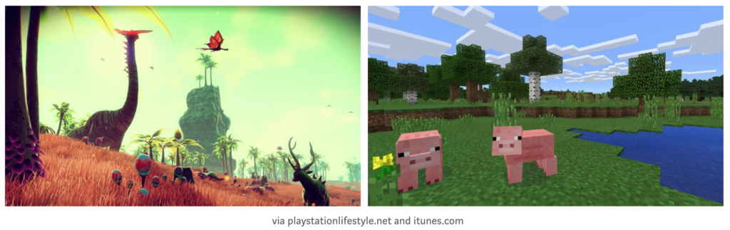
Let’s start with office design. Which one do you think is better? What’s your snap judgment?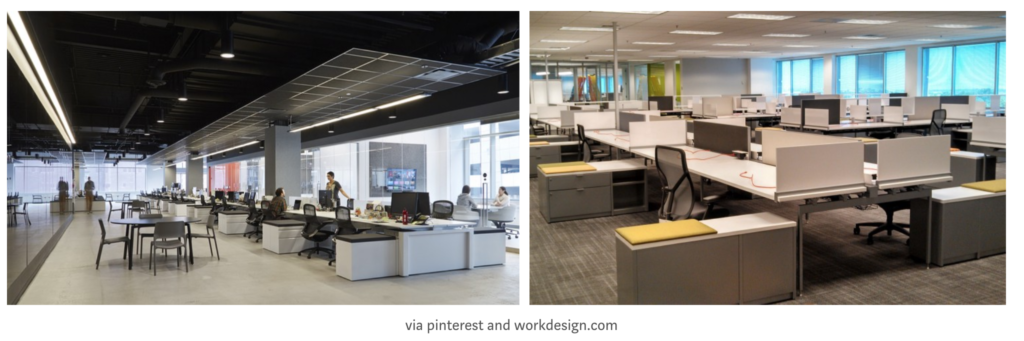 Now video games. From the following shots, which one do you think is better? (You might know these games, but take a first guess from these visuals)
Judging from the following clip, which movie do you think is better?

There’s three possible responses you could have thought of:
- This quiz is a trap. (Yep, it is)
- You liked either the left one or the right one. (We’ll see which one is better)
- You doubted whether there’s enough information to make a judgement on which one is better. (Fantastic response)
Here are the answers.
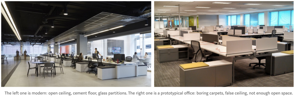
I prefer the left one. It looks beautiful. But guess what? The right one is a better office because it focuses on work getting done. Carpets may look boring, but they’re sound absorbers. Open ceiling looks beautiful but it reflects sound and creates echo. Open spaces (like in the left one) create breathing space but intrude privacy (notice that there are some chairs and tables behind workspace).
The one in the left is beautiful and it may create many wows when visitors visit, but the right one is focused at getting work done (which is the primary function of any office). It takes care of privacy at work and has lots of sound absorbents.
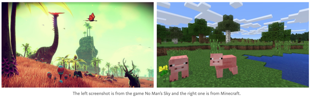
No Man’s Sky (on the left) was developed over 4 years by a team of 15 people (and would have costed in millions). Before launch it was hyped up tremendously, mostly because of its beautiful visuals and the fact that game features 18 quintillion (1.8×10^19) planets. Anyone will get excited about a game with these visuals and a quintillion planets to explore. Except that it was a big flop. It’s rated 5/10 on steam and features in Wikipedia’s List of video games notable for negative reception.
Minecraft (on the right) was developed by 1 person as a project that gradually evolved into an entire movement with 121 million copies sold. It was such a gigantic success that Microsoft bought Minecraft for over US$2.5 billion. Graphics are crude, but so what? The game’s a massive success.
The main difference between No Man’s Sky and Minecraft is that the latter is better designed because a game’s first priority should be gameplay. No amount of visual wizardry can save a game with bad gameplay. While No Man’s Sky had a quintillion planets to explore, all planets in the game had more or less similar things to do. Plus their multiplayer mode was a joke because there were so many planets in the game that it was almost impossible for two players to bump into each other. (Most reviews called No Man’s Sky infinitely boring). Minecraft, on the other hand, is a game where you create things. And this means truly infinitely varied gameplay. Despite the 8-bit crude graphics (or perhaps because of it), people have made working computers, space shuttles, game of thrones cities. This sort of gameplay made Minecraft worth billions.

Heaven’s Gate (on the left) is known for being the biggest disaster in Hollywood’s history. Quoting from Wikipedia’s entry on the film:
The film [Heaven’s Gate] resultantly opened to poor reviews, earning only $3.5 million domestically (from an estimated $44 million budget), eventually causing its parent studio, United Artists, to collapse.
The Blair Witch Project (on the right)
It became a resounding box office success, grossing nearly $250 million worldwide on a modest budget of $60,000, making it one of the most successful independent films of all time.
What happened here? Why isn’t big budget = better outcome?
What is good design?
People debate whether good design is subjective. I’ll argue that it’s not. Good art is subjective, but design isn’t. The main difference between art and design is that while art is made for oneself, design is made for someone else (the user) to achieve her objectives (not yours).
Designing for the user isn’t as easy as it sounds. One of the most difficult aspects of being a designer is to avoid letting your personal preferences dictate what’s good for the user. Thinking from user’s perspective doesn’t come naturally. Evolution has trained us to think from our own point of view. This is why great designers are rare — they are able to suppress their worldview and their preferences to think from the user’s point of view.
If I were to give a tweetable definition of what good design is, I’ll say it is this:
Design is knowing what your customers want to solve and prioritising their needs within tech, resources, time and cost constraints <tweet this>
The first difficulty in making good design is knowing what users want. If you never talk to them, you’ll never know what they want. I’ve come across a few designers who’d never talk to users and that’s baffling to me. The problem becomes graver if you are a designer for a product that you don’t personally use (common examples are designers at B2B companies). How can you design for a CRM user (a salesperson) if you have either never done a sale yourself or not invested enough time understanding a sales person’s priorities?
The second difficulty is understanding priorities of your user needs clearly because when you ask users what they want, they say they want everything. If you are designing a game, they want great gameplay and fantastic visuals. If you are designing an office, they want open space, privacy, great light, less distractions. As a designer, with cost, tech and resource constraints, you cannot deliver everything that the user wants. But do you know their preference priority list? If you are designing a car and cannot deliver everything your users desire, do you know what they care about more than anything else — looks, comfort, mileage, power, boot capacity, safety. Design is all about making the right tradeoffs for the user.
Why is enterprise software ugly?
If you have ever seen an ugly looking enterprise software and wondered who in their right mind buys or uses it, you don’t understand design.
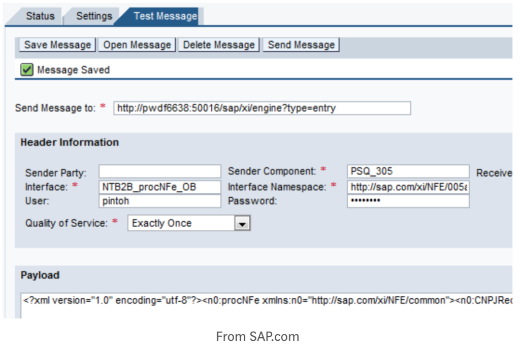
The key function of design is to get user’s job done. In case of a game, users’ expectation is of fun. In case of a movie, it’s suspense, drama and a good story. In case of a enterprise software, it’s to send out that invoice (or do entries for accounting). Sure, you get brownie points if the same software can be made to look better, but that beauty cannot substitute design for the functionality that user desires.
Never prioritize beauty over functionality. #gooddesign<tweet this>
In enterprise’ case, the priority is customizability, reliability, functionality and only then good looking UI comes. The designer who sacrifices giving more options in an enterprise software because these options come in the way of a clean look will have a hard time succeeding with users.
Another example of good design (but bad visual look) is the online dating website PlentyOfFish.
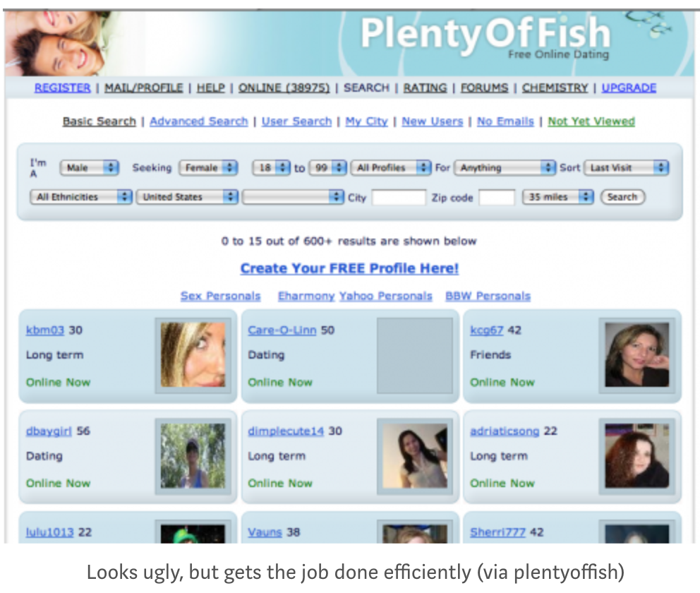
Sure the website looks ugly (even today! go check it out), but it is so successful that it was acquired for $575m by Match.com. The same principle of functionality > beauty applies here — the main job of the website is to quickly show profiles and allow you to send messages. If the website gets that job done, it qualifies for being called a good design.
Get new essays on your email:
Why new designers confuse beauty with good design?
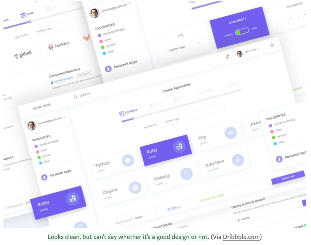
As I said, design is about users’ priorities not designers priorities. If designers spend a lot of their time on dribbble getting inspiration from popular visual shots, it’ll be difficult for them to forget that a horrible looking interface that gets the job done is better designed than a slick interface that gets in the way of user.
A horrible looking interface that gets the job done is better designed than a slick interface that gets in the way of user<tweet-this>
A good designer also doesn’t forget that products are just one touch point of the customer. Design needs to expand and take into consideration the overall experience of the user and his priorities during interaction with a company (and not just a product).
Another related problem in design is how hiring happens. For founders and entrepreneurs who do not have formal design education, it’s very difficult to look beyond a pretty looking portfolio. This problem is compounded also because many self taught designers start from a tool-first approach. They would teach themselves Photoshop or Sketch which are mainly visual design tools, but wouldn’t come across formal design principles (such as design thinking, interviewing techniques, human psychology, etc.)
Further Reading
- Demystifying Service Design — Part 1 by Erik Flowers
- Design Thinking, Not Just Another Buzzword by Marco Lopes
- How to apply a design thinking, HCD, UX or any creative process from scratch by Dan Nessler
- David Kelley, founder of IDEO and Stanford’s d.school, on How To Do Design Thinking by Avi Solomon
- The dribbblisation of design by Paul Adams of Intercom
Join 200k followers
Follow @paraschopra