Most likely, you’re going to read this sentence and hit the back button.
Still here?
Good, then you’re likely to scan through a few paragraphs in this article and then give up. (Unless, you’re a long-time reader and trust that my writing is worthy of your time. More on this later)
Why are humans so impatient on the web?
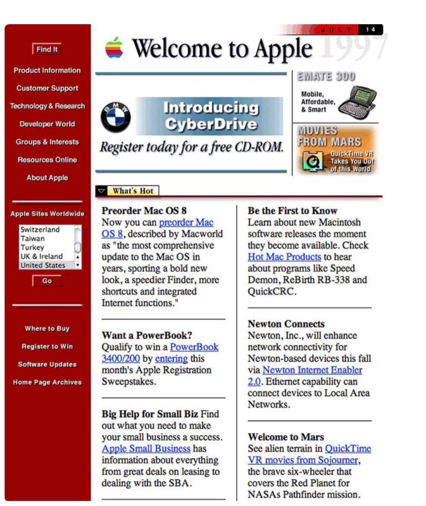
Back in the early 1990s, when the web was getting started, websites looked like this.
Today, the same website looks like this.
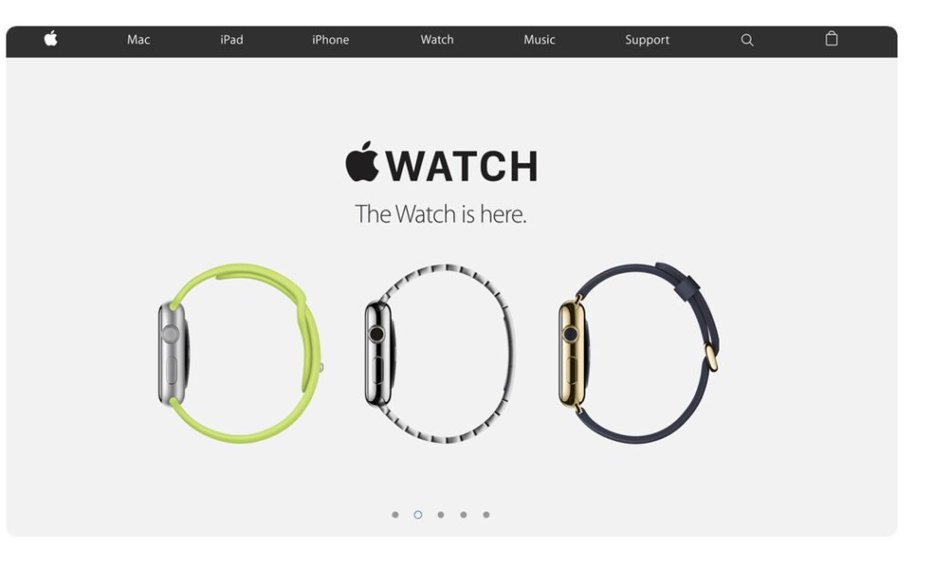
What happened?
The answer to the question of why the web is increasingly becoming more visual and less text-heavy will also shed light on how we decide what to spend time on, a question that creators and entrepreneurs need to be obsessed with.
Answer: humans are (near-) optimal value foragers
I know this sounds a bunch of crock shit, but bear with me for a bit and I promise it’ll pay off.
Imagine you’re a monkey in a forest who loves mangoes. The forest is big, and mango trees are spread in it randomly. So, as a mango-loving monkey, you have to decide which area of this huge forest do you want to explore first.
How will you decide?
Think before reading on.
Done thinking?
Okay, so you will likely look around, and observe which area of the forest seems like it could have a mango tree. Maybe, you spot parrots and from experience, you can tell that wherever there are parrots, there could be mangoes.
Perhaps you recall that the north direction is where you found mangoes last time, so you start walking north.
But if none of these mango-reminding signals are bubbling up in your consciousness, you’ll possibly start a random search, but will always keep your ears and eyes open to spot either a mango tree or its correlates.
Such correlates of mangoes exist because mango trees want to be spotted. These trees invest their limited resources in making tasty mangoes because their seeds get spread when the monkey eats the fruit and shit the seed in the ground. Like most long-term stable associations, it’s a give and take relationship between the mango tree and the monkey.
Because monkeys do a valuable service for a tree, this opens the possibility for deception. In theory, there could be another tree in the forest that looks-and-feels like a mango tree, fooling the monkey into eating its fruit without investing in making the energy-rich sugary pulp. This way, the deceptive-mango tree could have the monkey spend its energy on spreading the seed without giving too much of its own valuable resources, thereby profiting an “excess profit”.
(I don’t know whether such a mango-like deceptive tree exists, but nature is full of similar deceptions).
In an environment full of deceptions, monkeys that are inherently skeptical will preserve their energy, while the naively trusting monkeys will waste all their energy. If there are deceptions, it makes sense to look for signs of trust. What could be such signs of trust?
A real mango tree will have parrots near it. If there are no parrots, spending energy walking towards it is wasteful, as it’ll likely turn out to be deception.
TLDR
In a jungle with a mix of real and fake mangoes:
- Monkeys will pay extra attention to signs that remind them of real mangoes
- Monkeys will be impatient and skeptical about spending effort anywhere else (even if those directions, in theory, could have real mangoes)
Our economies are a bit like this jungle, and we’re the monkeys in it
Like monkeys, we’re not doing a sweeping, exhaustive search in the world to find valuable things. We’re impatient because our economies are full of deception. Why should we spend our 30 seconds watching an advertisement when we know that, more often than not, it’ll be about something we don’t give a damn about?
In evolutionary biology, Optimal Foraging Theory says that animals forage for food in a way that maximizes their net energy gain per unit of cost. If you’re a monkey, searching for mangoes takes energy. So, you first search nearby areas before venturing further off. As mentioned previously, you look for signals that tell real and fake mangoes apart.
This much is obvious: animals want to maximize their gain, while lowering their investment. But one (slightly) counter-intuitive implication of this is that animals happily abandon their foraging when the cost they expect to invest increases the gain they expect to derive. This is why you’d see monkeys happily abandon a real mango tree, without eating all the mangoes first, when reaching for more mangoes becomes a bit difficult.
This sort of behavior is predicted by the marginal value theorem, which is a mathematical model of how much time animals spend foraging food in a patch of land.
When one first arrives at a new apple tree, the number of apples picked per minute is high, but it rapidly decreases as the lowest-hanging fruits are depleted. Strategies in which too few apples are picked from each tree or where each tree is exhausted are suboptimal because they result, respectively, in time lost travelling among trees or picking the hard to find last few apples from a tree. The optimal time spent picking apples in each tree is thus a compromise between these two strategies
Via Marginal Value Theorem (Wikipedia)
Remember: it takes energy to get value, and an animal is always (subconsciously) calculating tradeoffs between expected value and expected cost.
We’re impatiently looking for signs of value
Now it’s time to put everything together. You’re online (which is like a jungle) and you know what you value (hopefully that includes mangoes, but things like entertainment, safety, joy, etc.). But the web is also a place of deception: people and businesses vying for your money and attention to extract profits for themselves, but without offering a lot in return.
How would you – dear consumer – behave in such a world?
You’ll look for (honest) signs of value. Whenever we come across anything, the first thought that’ll pop into your head would be:
What does this remind me of?
“What does this remind me of?” is a powerful question that both monkeys and humans ask because we’re trying to judge whether it’s worth spending time/money pursuing what we come across.
The reasons websites were text-heavy initially was because businesses wanted to remind people of magazines. And people trusted magazines because the editors screened out low-value garbage. Even the advertisements in magazines were from honest businesses because it required a large sum of money to place an ad.
But now anyone can publish a bunch of text on the web. The zero-cost of putting paragraphs on the web devalues the average text found on the web because humans are looking for signals of value and text is no longer that.
It’s not like people won’t read at all. They will, but only if there are other signals of value, like:
- A known author name or a trusted online publisher.
- A friend recommended them to read (and a friend has no reason to deceive)
- Value already provided upfront without asking for too much (hopefully, my first line did that!)
If you’ve read this far, one of the above three reasons is likely to be true.
Why the web has become increasingly visual?
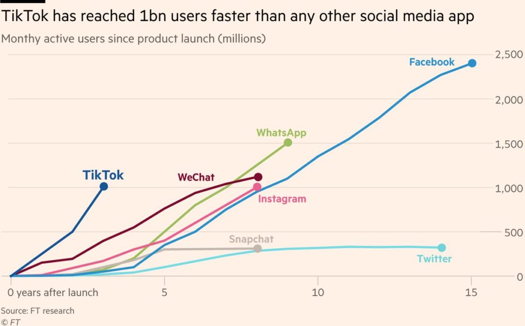
Most of the cost of foraging for food (or browsing on the web) is time. So, if you buy the idea that people try to optimally forage for signals of value, the world becoming more and more visual makes sense.
We process visual information much faster than text. Some studies peg it at 60,000 times faster (but such precise numbers are suspect). Nevertheless, before kids know how to read, they are already an expert at looking at things. In fact, even more than images, we’re evolved to look at motion – our world is full of things moving. Depending on how you look at things (pun intended), about a third to a half of our brain is dedicated to vision.
If the rational thing is to minimize the cost to find signals of value, you’d prefer to make up your mind from seeing first instead of wanting to read. This explains the evolution of the web from being text heavy to being visuals heavy and the rise of video-first platforms like Youtube, Instagram and TikTok.
Why does everything look the same?
Let’s take a pause and reiterate the key themes that we’ve explored so far:
- People want to find valuable things but want to invest minimal time in doing so
- Because deceptive businesses exist, people are OK to abandon exploration if they quickly don’t find signals of value
- People are visual creatures, so what they’re generally doing is looking at things and constantly asking themselves: what does this remind me of?
- If what they’re looking at reminds them of something they expect to be valuable, they continue engaging. Otherwise, they abandon and keep exploring.
Now, let’s answer why everything looks the same.

Everything looks the same because businesses have converged to the same signals that consumers are looking for.
Imagine you are entering a hotel lobby and there are no sofas to sit on. Or, in your room, you wake up in the morning and instead of instant coffee, you find Kombucha. All this will feel off, won’t it?
Everything looks the same because businesses can’t afford to look different. As consumers, when we look at a hotel lobby photo, we want to be reminded of the last time we had a comforting stay. Similarly, a movie poster that doesn’t look like a movie poster will just be ignored.
Remember: humans are trying to make snap judgments about whether it’s worth engaging in something or not. Businesses respond to that impatience by reusing the signals and memes that have worked in the past.
This does not imply that there’s no scope for originality. But such originality comes at a cost. All cars now look the same because the value chain of making a car has converged to components that consumers find valuable.
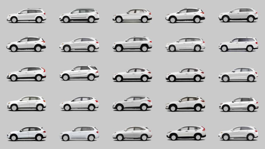
A car-maker who wants to be different has to pay an extra price:
- One, a literal extra price for non-standardized components in the industry.
- Two, the extra risk of such difference not mattering to the consumer
- Three, the possibility of doubt in the customer’s mind because what they see is too strange and doesn’t remind them of anything
This is why everything is a remix
Did you know that the famous Star Wars opening scene style was copied from somewhere else?
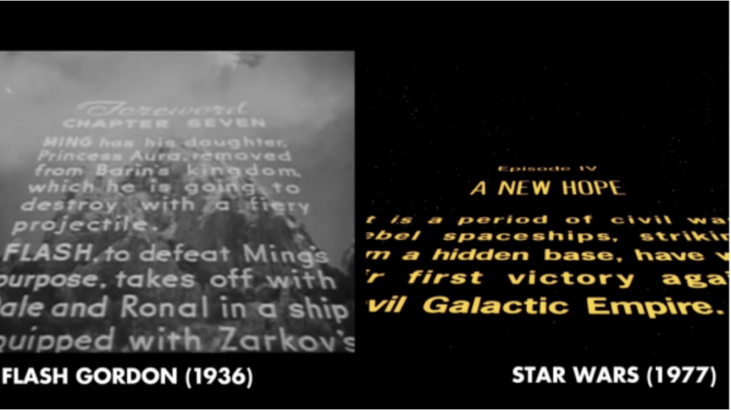
Yes, everything is a remix. But why?
It’s because successful things converge on what consumers find valuable, which is a small subset of all possible things. Out of all the images possible, only a subset of images is visually appealing, so no wonder two visually appealing images will share the same underlying patterns.
Same for musical chords. Almost all combinations of notes will sound bad, except a few. And that is what a lot of pop music converges on.
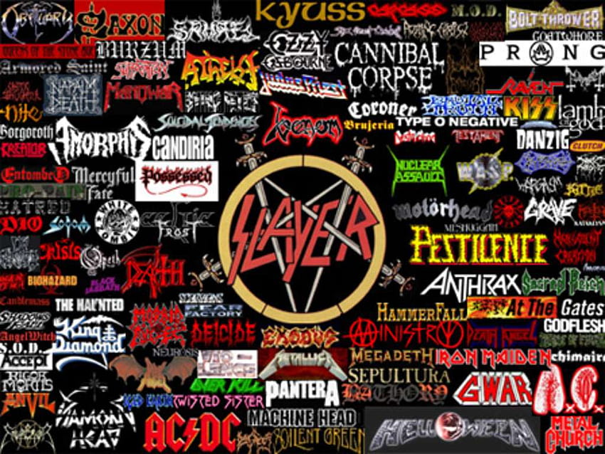
You’d be mistaken if you think such convergence only applies to popular genres (such as pop music, or blockbuster Hollywood). All fringe sub-genres have common patterns that remind their fans of the category they belong to.
Where do visual trends come from?
The insight that consumers are constantly asking “what does this remind me of” also explains why there are sudden shifts in visual trends.
Let’s take logos of luxury brands. Almost all of them now look the same now. Why?
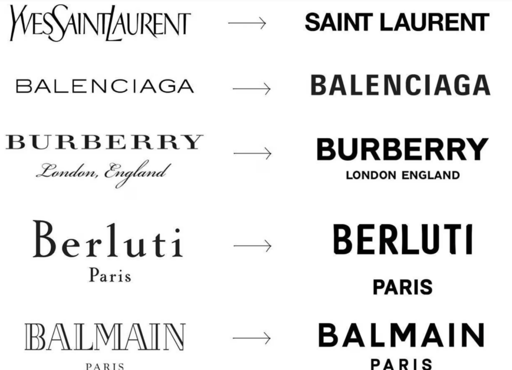
The origin of trends is usually random. But once there’s enough “center of gravity” around a visual trend, the remaining brands have to follow the trend, or else they’ll be seen as outdated. This “center of gravity” can shift for a sensible reason: maybe the new logo is actually an improvement for the changing world (let’s say a bold logo looks more readable on Instagram)
But it can also shift for trivial reasons: perhaps an influential voice in your community noticed an upstart and elevated their boldness. So, a few others follow, shifting the “center of gravity”.
Whatever the reason for the initial shift, once a trend gets going, consumers notice it and whoever doesn’t adapt will generate feelings of being outdated. Talking of outdated, imagine a website today that still looks like web 2.0. Will you purchase anything from it?
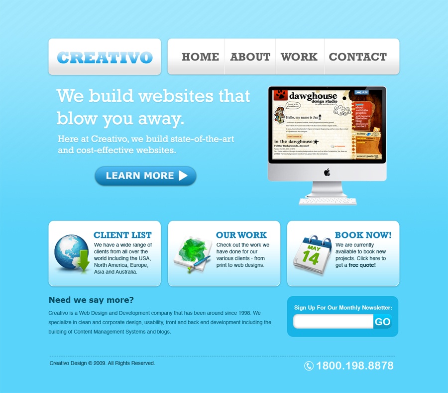
This “center of gravity” hypothesis also explains why the Japanese web is so different.
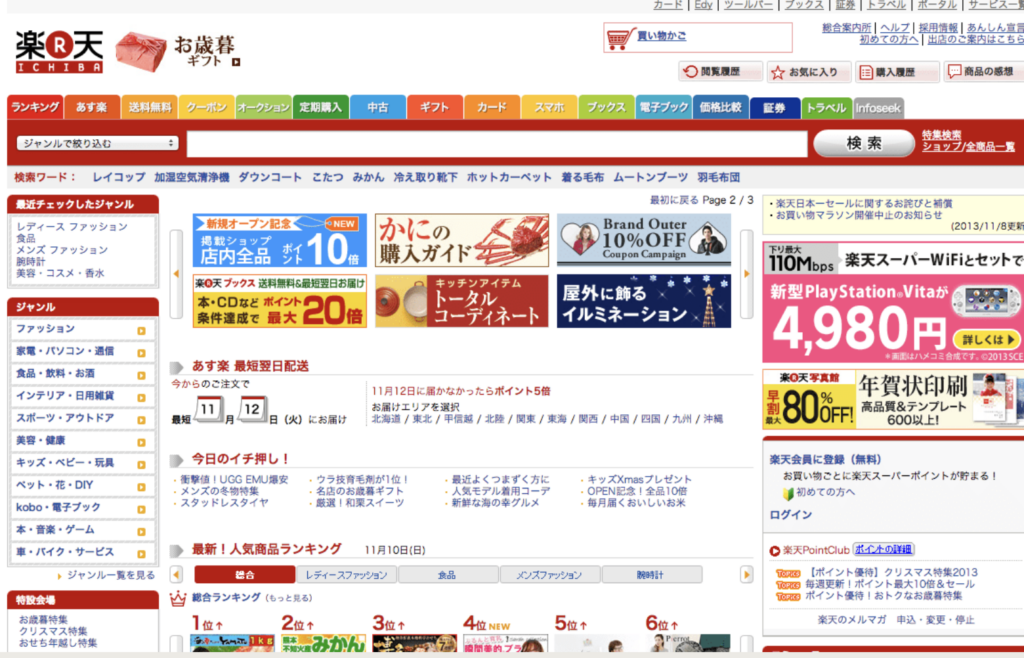
The Japanese have come to expect web design in a certain way, and if you break the norm, you risk being put in the “too strange” territory and people are going to move on to something else quickly. So, everyone in Japan designs information-rich interfaces.
What does this all mean for a creator?
All this theory of what humans find worth spending their time and money on should translate into increasing one’s odds of creating a successful thing. It could be a product, a story, a song, a movie or a painting – but if you’re a creator, pay attention to what makes people pay attention.
There are two ways to go about creating what others like:
From first principles
You can apply the core principles of optimal (information) foraging and make something that satisfies those principles. Doing this well is extremely hard because the human brain integrates multiple signals to generate a gut feeling of trust or mistrust.
Unless you’re a genius or lucky, you’ll likely go wrong in a few of such signals. When that happens, your audience will sense a weirdness in what they see, and they’ll abandon your creation.
Excessive creativity often pushes creations into a weird category.
Copy what’s popular and differentiate where it matters
Many creators don’t like to do this, as they want to be “truly” original. Keep in mind that nobody is without a prior inspiration (not even George Lucas with Star Wars, or even Shakespeare). So, a much better approach is to study what has been popular or successful among your audience and then copy it while differentiating just a tiny bit.
Copying something successful inherits most of its properties that had made it successful (this works even if you fully don’t understand what elements made something successful). At the same time, copying also works to remind your audience that they should expect a similar quality from you as the original, successful thing that you’re copying from.
Do an in-depth study of successful things in your area. Absorb them, recreate them. The more thorough your study, the more intuitively you’ll grasp what makes things successful.
What about differentiation? A creator shouldn’t worry too much about differentiation, as that happens automatically. You can’t help but leave your mark on whatever you make. So, stop worrying about differentiation.
Summing up: think of what you’re creating as a page-turner novel
Since humans are impatient value foragers, a good model to think about creation of any kind is a page-turning novel. These books keep on dropping hints of future value at regular steps in the reader’s journey. For books, future value is an answer to unresolved questions in the story. For products, value dropping must start with the landing page and then continue in the free trial.
For offline stores, it needs to start with the window sign and then continue with the first shelf people see when they enter.
What kind of value, you ask? The answer is domain-dependent. For landing pages, study the landing pages in your domain that are highest converting. Same with free trials, window signs and store design. Don’t shy away from exhaustive research. Don’t think it’ll kill your creativity. On the contrary, it’ll fire up your creativity. It’ll give you ideas for differentiating, while keeping you grounded to what your audience expects to find valuable.
To sum up, whatever the context, to keep other humans engaged, a creator must keep increasing future anticipated value by dropping signs of whatever the other humans consider as valuable in that context.
At all points of time, keep reminding your audience that more value is yet to come.
Join 200k followers
Follow @paraschopra