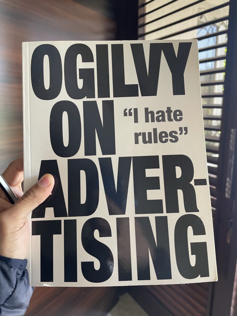
This one is a dated book – it describes advertising in the age when digital channels didn’t exist. But that doesn’t make it irrelevant.
Rather, the basic principles that made a great ad in the TV/print era remain the same. Consumer psychology is shaped by a million years of evolution, so while mediums change, what makes people buy stuff doesn’t.
My notes from the book
How to work with an agency
- Leaf through the medium you’re interested in and see which ads strike you the most
- Find out who made those ads
- Talk to their head and creative director
- Ask them to give their best ads
- Go with the one who appeal you the most
Principles of writing headlines
- Spend a lot of time getting the headline right (5 times more people read it vs copy)
- Headline should promise the reader a clear benefit
- News style headlines work (introducing, amazing, now, suddenly)
- Include brand name in headline (most people don’t read copy and wouldn’t know what product is being advertised)
- Personalise. If a product targets certain people, put a word in the headline to address them.
- Specifics work better than generics.
- Helpful information work great as headline (e.g. how to do xyz).
- Don’t put full stops in headlines, as they stop the reader.
- Use a standard font that everyone can read easily (those that people are accustomed to reading)
- Drama belongs to what you say, not in the typeface.
Principles of illustrations
- The job of illustrations is to catch interest while the reader is leafing, though. It should inspire curiosity (what’s going on), that the copy will answer.
- Photos work better than drawings.
- Keep illustrations simple (one person)
- Before and after ads work great
- People notice advertisements that feature models of their own sex only (men notice men, while women notice women)
- More people read captions under images than copy, so always put captions under images. The caption should include brand name and promise.
Principles of copy
- Write in story format (hook people)
- Write in everyday language (simple words)
- Don’t use analogies (people don’t understand)
- Don’t use celebrities (people remember them, not the product)
- Include the price always (people move on when they don’t know the price)
- Long copy works better than short copy (as the more facts you tell, the more you sell), but with long copy, the first paragraph should be a grabber (and not generic)
- A subheadline helps whet the appetite for the copy
- Limit opening paragraph to 11 words
Layout
- Readers first look at illustration, then at headline, then at copy (so put them in that order)
- Headlines below illustration are read by 10% more than headlines above illustration
- Advertisements shouldn’t look like ads (they should look like editorial)
General
- Copy what’s working (don’t innovate until you have a better idea)
- Pretend you’re an editor (not an ad creator) and you’ll get more sign-ups
- Never set copy in black background over white (they’re hard to read)
Posters ...